An Interactive Map of the Universe

There’s a new interactive map of the Universe created by astronomers at Johns Hopkins University using data from the Sloan Digital Sky Survey. You can read all about it here There’s also a nice video to watch:
The picture at the top of this post is not the actual map, it’s just a publicity poster. You can play with the fully interactive version here.
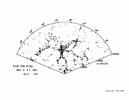
This reminds me that when I started as a researcher in cosmology, back in 1985, the biggest galaxy redshift survey available had only just over a thousand galaxies in it and probed only a tiny fraction of the volume of the Universe that has now been mapped, i.e. only out to a redshift of about 0.05.
I think this is called progress!

November 21, 2022 at 1:15 pm
[…] An Interactive Map of the Universe […]