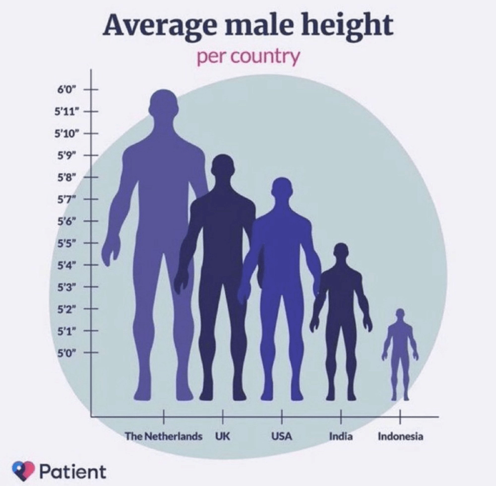
How many things are wrong about this graphic?
This entry was posted on January 9, 2024 at 11:05 pm and is filed under Bad Statistics. You can follow any responses to this entry through the RSS 2.0 feed.
You can leave a response, or trackback from your own site.

January 10, 2024 at 9:40 am
1. The y-axis does not start at zero.
2. The human figures guide the eye/brain to think of area, which is proportional to the square of height, rather than height itself.
3. No data details are given in the caption – 20-year-olds? Year of sampling? Multiracial?
A truly great book is The Visual Display of Quantitative Information by E.R. Tufte (who has written other books on the theme).
January 10, 2024 at 10:32 am
Even the Dutch seem less than 50 cm tall. From experience, that seems unlikely unless this is length at birth.