Archive for the Bad Statistics Category

Eurovision Scores and Ranks

Posted in Bad Statistics, Television with tags on May 14, 2023 by telescoper

After last night’s Eurovision 2023 extravaganza I thought I’d work off my hangover by summarizing the voting. The vote is split into 50% jury votes and 50% televotes from audiences sitting at home, drunk. It’s perhaps worth mentioning that the juries do their scores based on the dress rehearsals on Friday so they are not based on the performances the viewers see.

Each country/jury has 58 points to award, shared among 10 countries: 1-8, 10 and 12 for the top score. Countries that didn’t make it to the final (e.g. Ireland) also get to vote. For the televotes only there is also a “rest-of-the-world” vote for non-Eurovision countries.

This system can deliver very harsh results because only 10 songs can get points from a given source. It’s possible to be judged the 11th best across the board and score nil!

Here are the final scores in a table:

RankCountryOverallTelevotesJuryDiffRank Diff
1Sweden 583243340+97+1
2Finland526376150-226-1
3Israel362185177-8+3
4Italy350174176+2+3
5Norway26821652-168-14
6 Ukraine24318954-145-11
7Belgium18255127+72+5
8. Estonia16822146+124+14
9.Australia15121130+109+14
10. Czechia1293594+59+7
11.Lithuania1274681+35+4
12.Cyprus1265868+10-2
13.Croatia12311211-101-18
14. Armenia1225369+16+1
15.Austria12016104+88+13
16.France1045054+4-2
17. Spain100595+90+17
18.Moldova967620-56-11
19. Poland938112-69-16
20.Switzerland923161+30+4
21.Slovenia784533-12-3
22.Albania765917-42-11
23.Portugal591643+27+4
24.Serbia301614+20
25.United Kingdom24922+130
26. Germany18153-12-2
Final Scores by country in Eurovision 2023 showing the breakdown into televotes and jury votes, together with the difference in numerical scores awarded and difference in ranking based on jury votes rather than televotes, e.g. Albania scored 42 fewer points on the jury votes and would have been 11 places higher based just on televotes than just on jury votes.

Going into the last allocation of televotes, Finland were in in the lead thanks to their own huge televote, but Sweden managed to win despite a lower televote allocation because of their huge score on the jury votes. Had the scores been based on the jury votes alone, Sweden would have won by a mile, and if only on the televotes Finland would have won. Anyway, rules is rules…

There are some interestingly odd features in the above dataset. For example, Switzerland ranked 20th overall, but were ranked 18th and 14th by televotes and jury votes respectively. There are also cases in which a higher score in one set of votes leads to a lower rank, and vice-versa. Croatia were hammered by the jury votes, ranking 25th out of 26 on that basis but would have been 7th based on televotes alone; hence their -18 in the last column. A similar fate befell Norway. By contrast, Spain were last (26th) on the televotes but placed 9th in the pecking order by the juries; they ended up in 17th place.

Anyway, you can see that there are considerable differences between the scores and ranks based on the public vote and the jury votes. I have therefore deployed my vast knowledge of statistics to calculate the Spearman Rank Correlation Coefficient between the ranks based on televotes only and based on jury votes only. The result is 0.26. Using my trusty statistical tables, noting that n=26, and wearing a frequentist hat for simplicity, I find that there is no significant evidence for correlation between the two sets of ranks. I can’t say I’m surprised.

The apparent randomness of the scoring process introduces a considerable amount of churn into the system, as demonstrated by Mel Giedroyc in this, the iconic image of last night’s events.

At least I think that’s what she’s doing…

Anyway, for the record, I should say that my favourite three songs were Albania (22nd), Portugal (23rd) and Austria (15th). Maybe one day I’ll pick a song that makes it onto the left-hand half of the screen!

P.S. Eurovision 2024 will be in Sweden, which is nice because it will be the 50th anniversary of ABBA winning with Waterloo. I’ll never tire of boring people with the fact that a mere 15 years after ABBA won, I walked across the very same stage at the Brighton Centre to collect my doctorate from Sussex University…

Unknown Unknowns

Posted in Bad Statistics, History on May 2, 2023 by telescoper

I was surprised today that some students I was talking to couldn’t identify the leading American philosopher and social scientist responsible for this pithy summation of the limits of human knowledge:

Obviously it’s from before their time. How about you? Without using Google, can you identify the origin of this clear and insightful description?

Cosmological Dipole Controversy

Posted in Astrohype, Bad Statistics, The Universe and Stuff with tags , , on October 11, 2022 by telescoper

I’ve just finished reading an interesting paper by Secrest et al. which has attracted some attention recently. It’s published in the Astrophysical Journal Letters but is also available on the arXiv here. I blogged about earlier work by some of these authors here.

The abstract of the current paper is:

We present the first joint analysis of catalogs of radio galaxies and quasars to determine if their sky distribution is consistent with the standard ΛCDM model of cosmology. This model is based on the cosmological principle, which asserts that the universe is statistically isotropic and homogeneous on large scales, so the observed dipole anisotropy in the cosmic microwave background (CMB) must be attributed to our local peculiar motion. We test the null hypothesis that there is a dipole anisotropy in the sky distribution of radio galaxies and quasars consistent with the motion inferred from the CMB, as is expected for cosmologically distant sources. Our two samples, constructed respectively from the NRAO VLA Sky Survey and the Wide-field Infrared Survey Explorer, are systematically independent and have no shared objects. Using a completely general statistic that accounts for correlation between the found dipole amplitude and its directional offset from the CMB dipole, the null hypothesis is independently rejected by the radio galaxy and quasar samples with p-value of 8.9×10⁻³ and 1.2×10⁻⁵, respectively, corresponding to 2.6σ and 4.4σ significance. The joint significance, using sample size-weighted Z-scores, is 5.1σ. We show that the radio galaxy and quasar dipoles are consistent with each other and find no evidence for any frequency dependence of the amplitude. The consistency of the two dipoles improves if we boost to the CMB frame assuming its dipole to be fully kinematic, suggesting that cosmologically distant radio galaxies and quasars may have an intrinsic anisotropy in this frame.

I can summarize the paper in the form of this well-worn meme:

My main reaction to the paper – apart from finding it interesting – is that if I were doing this I wouldn’t take the frequentist approach used by the authors as this doesn’t address the real question of whether the data prefer some alternative model over the standard cosmological model.

As was the case with a Nature piece I blogged about some time ago, this article focuses on the p-value, a frequentist concept that corresponds to the probability of obtaining a value at least as large as that obtained for a test statistic under a particular null hypothesis. To give an example, the null hypothesis might be that two variates are uncorrelated; the test statistic might be the sample correlation coefficient r obtained from a set of bivariate data. If the data were uncorrelated then r would have a known probability distribution, and if the value measured from the sample were such that its numerical value would be exceeded with a probability of 0.05 then the p-value (or significance level) is 0.05. This is usually called a ‘2σ’ result because for Gaussian statistics a variable has a probability of 95% of lying within 2σ of the mean value.

Anyway, whatever the null hypothesis happens to be, you can see that the way a frequentist would proceed would be to calculate what the distribution of measurements would be if it were true. If the actual measurement is deemed to be unlikely (say that it is so high that only 1% of measurements would turn out that large under the null hypothesis) then you reject the null, in this case with a “level of significance” of 1%. If you don’t reject it then you tacitly accept it unless and until another experiment does persuade you to shift your allegiance.

But the p-value merely specifies the probability that you would reject the null-hypothesis if it were correct. This is what you would call making a Type I error. It says nothing at all about the probability that the null hypothesis is actually a correct description of the data. To make that sort of statement you would need to specify an alternative distribution, calculate the distribution based on it, and hence determine the statistical power of the test, i.e. the probability that you would actually reject the null hypothesis when it is incorrect. To fail to reject the null hypothesis when it’s actually incorrect is to make a Type II error.

If all this stuff about p-values, significance, power and Type I and Type II errors seems a bit bizarre, I think that’s because it is. In fact I feel so strongly about this that if I had my way I’d ban p-values altogether…

This is not an objection to the value of the p-value chosen, and whether this is 0.005 rather than 0.05 or, , a 5σ standard (which translates to about 0.000001!  While it is true that this would throw out a lot of flaky ‘two-sigma’ results, it doesn’t alter the basic problem which is that the frequentist approach to hypothesis testing is intrinsically confusing compared to the logically clearer Bayesian approach. In particular, most of the time the p-value is an answer to a question which is quite different from that which a scientist would actually want to ask, which is what the data have to say about the probability of a specific hypothesis being true or sometimes whether the data imply one hypothesis more strongly than another. I’ve banged on about Bayesian methods quite enough on this blog so I won’t repeat the arguments here, except that such approaches focus on the probability of a hypothesis being right given the data, rather than on properties that the data might have given the hypothesis.

Not that it’s always easy to implement the (better) Bayesian approach. It’s especially difficult when the data are affected by complicated noise statistics and selection effects, and/or when it is difficult to formulate a hypothesis test rigorously because one does not have a clear alternative hypothesis in mind. That’s probably why many scientists prefer to accept the limitations of the frequentist approach than tackle the admittedly very challenging problems of going Bayesian.

But having indulged in that methodological rant, I certainly have an open mind about departures from isotropy on large scales. The correct scientific approach is now to reanalyze the data used in this paper to see if the result presented stands up, which it very well might.

GAA Clustering

Posted in Bad Statistics, GAA, The Universe and Stuff with tags , , , , , , on July 25, 2022 by telescoper
The distribution of GAA pitches in Ireland

The above picture was doing the rounds on Twitter yesterday ahead of this year’s All-Ireland Football Final at Croke Park (won by favourites Kerry despite a valiant effort from Galway, who led for much of the game and didn’t play at all like underdogs).

The picture above shows the distribution of Gaelic Athletics Association (GAA) grounds around Ireland. In case you didn’t know, Hurling and Gaelic Football are played on the same pitch with the same goals and markings on the field. First thing you notice is that the grounds are plentiful! Obviously the distribution is clustered around major population centres – Dublin, Cork, Limerick and Galway are particularly clear – but other than that the distribution is quite uniform, though in less populated areas the grounds tend to be less densely packed.

The eye is also drawn to filamentary features, probably related to major arterial roads. People need to be able to get to the grounds, after all. Or am I reading too much into these apparent structures? The eye is notoriously keen to see patterns where none really exist, a point I’ve made repeatedly on this blog in the context of galaxy clustering.

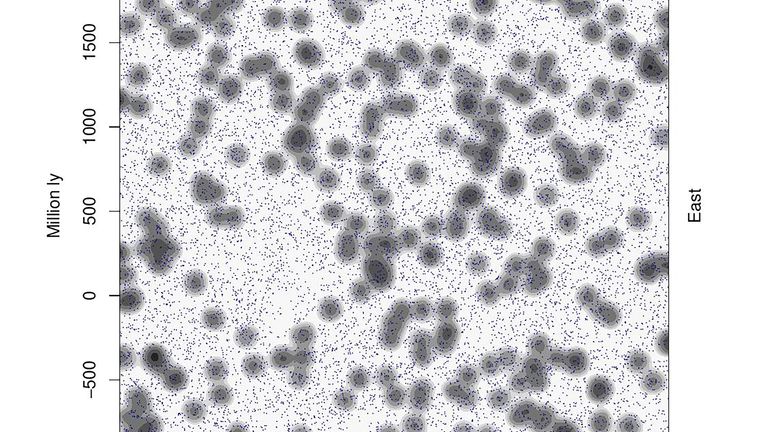
The statistical description of clustered point patterns is a fascinating subject, because it makes contact with the way in which our eyes and brain perceive pattern. I’ve spent a large part of my research career trying to figure out efficient ways of quantifying pattern in an objective way and I can tell you it’s not easy, especially when the data are prone to systematic errors and glitches. I can only touch on the subject here, but to see what I am talking about look at the two patterns below:

You will have to take my word for it that one of these is a realization of a two-dimensional Poisson point process and the other contains correlations between the points. One therefore has a real pattern to it, and one is a realization of a completely unstructured random process.

random or non-random?

I show this example in popular talks and get the audience to vote on which one is the random one. The vast majority usually think that the one on the right that  is random and the one on the left is the one with structure to it. It is not hard to see why. The right-hand pattern is very smooth (what one would naively expect for a constant probability of finding a point at any position in the two-dimensional space) , whereas the left-hand one seems to offer a profusion of linear, filamentary features and densely concentrated clusters.

In fact, it’s the picture on the left that was generated by a Poisson process using a  Monte Carlo random number generator. All the structure that is visually apparent is imposed by our own sensory apparatus, which has evolved to be so good at discerning patterns that it finds them when they’re not even there!

The right-hand process is also generated by a Monte Carlo technique, but the algorithm is more complicated. In this case the presence of a point at some location suppresses the probability of having other points in the vicinity. Each event has a zone of avoidance around it; the points are therefore anticorrelated. The result of this is that the pattern is much smoother than a truly random process should be. In fact, this simulation has nothing to do with galaxy clustering really. The algorithm used to generate it was meant to mimic the behaviour of glow-worms which tend to eat each other if they get  too close. That’s why they spread themselves out in space more uniformly than in the random pattern.

Incidentally, I got both pictures from Stephen Jay Gould’s collection of essays Bully for Brontosaurus and used them, with appropriate credit and copyright permission, in my own book From Cosmos to Chaos.

The tendency to find things that are not there is quite well known to astronomers. The constellations which we all recognize so easily are not physical associations of stars, but are just chance alignments on the sky of things at vastly different distances in space. That is not to say that they are random, but the pattern they form is not caused by direct correlations between the stars. Galaxies form real three-dimensional physical associations through their direct gravitational effect on one another.

People are actually pretty hopeless at understanding what “really” random processes look like, probably because the word random is used so often in very imprecise ways and they don’t know what it means in a specific context like this.  The point about random processes, even simpler ones like repeated tossing of a coin, is that coincidences happen much more frequently than one might suppose.

I suppose there is an evolutionary reason why our brains like to impose order on things in a general way. More specifically scientists often use perceived patterns in order to construct hypotheses. However these hypotheses must be tested objectively and often the initial impressions turn out to be figments of the imagination, like the canals on Mars.

Research Excellence in Physics

Posted in Bad Statistics, Education, Science Politics on May 16, 2022 by telescoper

For no other reason that I was a bit bored watching the FA Cup Final on Saturday I decided to construct an alternative to the Research Excellence Framework rankings for Physics produced by the Times Higher last week.

The table below shows for each Unit of Assessment (UoA):  the Times Higher rank;  the number of Full-Time Equivalent staff submitted;  the overall percentage of the submission rated  4*;  and the number of FTE’s worth of 4* stuff (final column), by which the institutions are sorted. The logic for this – insofar as there is any – is that the amount of money allocated is probably going to be more strongly weighted to 4* (though not perhaps the 100% I am effectively assuming) than the GPA used in the Times Higher.

1. University of Oxford 9= 171.3 57 97.6
2. University of Cambridge 3 148.2 64 94.8
3. Imperial College 18= 130.1 49 63.7
4. University of Edinburgh 13= 118.0 51 60.2
5. University of Manchester 2 87 66 57.4
6. University College London 24= 112.5 42 47.3
7. University of Durham 23 84.2 45 37.9
8. University of Nottingham 7 63.9 59 37.7
9. University of Warwick 20 79.2 47 37.2
10. University of Birmingham 4 55.2 66 36.4
11. University of Bristol 5 54.1 61 33.0
12. University of Glasgow 12 58.2 53 30.8
13. University of York 13= 59.9 51 30.5
14. University of Lancaster 21 56.1 46 25.8
15. University of Strathclyde 13= 46.7 52 24.3
16. Cardiff University 18= 52.2 46 24.0
17. University of Exeter 22 49.4 48 23.7
18. University of Sheffield 1 34.7 65 22.5
19. University of St Andrews 8 40.8 55 22.4
20. University of Liverpool 16 44.4 49 21.7
21. University of Leeds 9= 34 53 18.0
22. University of Sussex 26 42.7 42 17.9
23. The University of Bath 24= 38.8 42 16.3
24. Queen’s University of Belfast 31 49.7 32 15.9
25. Queen Mary University of London 28= 48 33 15.8
26, University of Southampton 27 41.7 38 15.8
27. The Open University 32= 41.8 36 15.0
28. University of Hertfordshire 38 42 32 13.4
29. Liverpool John Moores University 17 25.8 50 12.9
30. Heriot-Watt University 9= 21 55 11.6
31. King’s College London 28= 33.9 34 11.5
32. University of Portsmouth 6 19.8 58 11.5
33. University of Leicester 35= 34.3 28 9.6
34. University of Surrey 35= 30.6 31 9.5
35. Swansea University 32= 25.2 32 8.0
36. Royal Holloway and Bedford New College 35= 19.1 36 6.9
37. University of Central Lancashire 39 19.3 25 4.8
38. Loughborough University 40 19.8 22 4.4
39. University of Keele 32= 9 38 3.4
40. The University of Hull 30 11 28 3.1
41. University of Lincoln 43 15.2 16 2.4
42.The University of Kent 41 19 12 2.3
43. Aberystwyth University 44 18.2 7 1.3
44. University of the West of Scotland 42 8 11 0.9

Using this method to order institutions produces a list which clearly correlates with the Times Higher ordering – the Spearman rank correlation coefficient is + 0.75 – but there are also some big differences. For example, Oxford (=9th in the Times Higher) and Cambridge (3rd) come out 1st and 2nd with Imperial (=18th in the Times Higher) moving up to 3rd place. Edinburgh moves up from =13th to 4th. The top ranked UoA in the Times Higher table is Sheffield, which drops to 18th in this table. Portsmouth (6th in the Times Higher) drops to 32nd in this version. And so on.

Of course you shouldn’t take this seriously at all. The lesson -if there is one – is that the use of the Research Excellence Framework results to produce rankings is a bit arbitrary, to say the least…

Census Day

Posted in Bad Statistics, Biographical, The Universe and Stuff with tags , on April 3, 2022 by telescoper

Today is April 3rd 2022 which means that it’s Census Day here in Ireland; I’ve just finished filling in the form, which is 24 pages long but it turns out lots of the pages are duplicates for use in homes with multiple occupancy, and others don’t apply to me at all, so in fact I only had to complete 8 pages and it didn’t take all that long.

The Census should have taken place last year but was postponed because of the Covid-19 pandemic. Apparently the corresponding 2021 census in the UK went ahead, though I wasn’t at, and couldn’t get to, the property I still own in Wales so couldn’t participate. Although I was initially threatened with a fine, the UK Census people seem to have given up trying to chase me. I blogged about the previous census in Wales in 2011 here.

On the holiday after St Patrick’s Day I was at home when I noticed a card had been pushed through my letterbox while I was still in the house. It was from a ‘Census Enumerator’ who said he had tried to deliver the form but I was out. I wasn’t out and he hadn’t rung the doorbell. More importantly he hadn’t simply put the census form through the letterbox. In the UK the census forms are just sent out in the post. This little episode didn’t inspire me with confidence. Anyway, the bloke came back a week later and gave me the form. He also asked me for some personal information such as my phone number, which I naturally refused to give him. Apparently he has to collect the form in person too, which seems daft to me. Why can’t people just send their census returns back in the post?

On the last page there is a so-called ‘time capsule’ in which to leave information for historians to read 100 years from now. All I could think of to write was any historians reading this in 2122 would probably think that it was absurd to be doing this wasteful paper-based census when the digital age started some time ago, so I just said for the record that I was one of the people who thought that in 2022…

Solar Corona?

Posted in Bad Statistics, Covid-19, mathematics, The Universe and Stuff on December 8, 2021 by telescoper

A colleague pointed out to me yesterday that  evidence is emerging of a four-month periodicity in the number of Covid-19 cases worldwide:

The above graph shows a smoothed version of the data. The raw data also show a clear 7-day periodicity owing to the fact that reporting is reduced at weekends:

I’ll leave it as an exercise for the student to perform a Fourier-transform of the data to demonstrate these effects more convincingly.

Said colleague also pointed out this paper which has the title New indications of the 4-month oscillation in solar activity, atmospheric circulation and Earth’s rotation and the abstract:

The 4-month oscillation, detected earlier by the same authors in geophysical and solar data series, is now confirmed by the analysis of other observations. In the present results the 4-month oscillation is better emphasized than in previous results, and the analysis of the new series confirms that the solar activity contribution to the global atmospheric circulation and consequently to the Earth’s rotation is not negligeable. It is shown that in the effective atmospheric angular momentum and Earth’s rotation, its amplitude is slightly above the amplitude of the oscillation known as the Madden-Julian cycle.

I wonder if these could, by any chance, be related?

P.S. Before I get thrown into social media prison let me make it clear that I am not proposing this as a serious theory!

Citation Metrics and “Judging People’s Careers”

Posted in Bad Statistics, The Universe and Stuff with tags , , , , on October 29, 2021 by telescoper

There’s a paper on the arXiv by John Kormendy entitled Metrics of research impact in astronomy: Predicting later impact from metrics measured 10-15 years after the PhD. The abstract is as follows.

This paper calibrates how metrics derivable from the SAO/NASA Astrophysics Data System can be used to estimate the future impact of astronomy research careers and thereby to inform decisions on resource allocation such as job hires and tenure decisions. Three metrics are used, citations of refereed papers, citations of all publications normalized by the numbers of co-authors, and citations of all first-author papers. Each is individually calibrated as an impact predictor in the book Kormendy (2020), “Metrics of Research Impact in Astronomy” (Publ Astron Soc Pac, San Francisco). How this is done is reviewed in the first half of this paper. Then, I show that averaging results from three metrics produces more accurate predictions. Average prediction machines are constructed for different cohorts of 1990-2007 PhDs and used to postdict 2017 impact from metrics measured 10, 12, and 15 years after the PhD. The time span over which prediction is made ranges from 0 years for 2007 PhDs to 17 years for 1990 PhDs using metrics measured 10 years after the PhD. Calibration is based on perceived 2017 impact as voted by 22 experienced astronomers for 510 faculty members at 17 highly-ranked university astronomy departments world-wide. Prediction machinery reproduces voted impact estimates with an RMS uncertainty of 1/8 of the dynamic range for people in the study sample. The aim of this work is to lend some of the rigor that is normally used in scientific research to the difficult and subjective job of judging people’s careers.

This paper has understandably generated a considerable reaction on social media especially from early career researchers dismayed at how senior astronomers apparently think they should be judged. Presumably “judging people’s careers” means deciding whether or not they should get tenure (or equivalent) although the phrase is not a pleasant one to use.

My own opinion is that while citations and other bibliometric indicators do contain some information, they are extremely difficult to apply in the modern era in which so many high-impact results are generated by large international teams. Note also the extreme selectivity of this exercise: just 22 “experienced astronomers” provide the :calibration” which is for faculty in just 17 “highly-ranked” university astronomy departments. No possibility of any bias there, obviously. Subjectivity doesn’t turn into objectivity just because you make it quantitative.

If you’re interested here are the names of the 22:

Note that the author of the paper is himself on the list. I find that deeply inappropriate.

Anyway, the overall level of statistical gibberish in this paper is such that I am amazed it has been accepted for publication, but then it is in the Proceedings of the National Academy of Sciences, a journal that has form when it comes to dodgy statistics. If I understand correctly, PNAS has a route that allows “senior” authors to publish papers without passing through peer review. That’s the only explanation I can think of for this.

As a rejoinder I’d like to mention this paper by Adler et al. from 12 years ago, which has the following abstract:

This is a report about the use and misuse of citation data in the assessment of scientific research. The idea that research assessment must be done using “simple and objective” methods is increasingly prevalent today. The “simple and objective” methods are broadly interpreted as bibliometrics, that is, citation data and the statistics derived from them. There is a belief that citation statistics are inherently more accurate because they substitute simple numbers for complex judgments, and hence overcome the possible subjectivity of peer review. But this belief is unfounded.

O brave new world that has such metrics in it.

Update: John Kormendy has now withdrawn the paper; you can see his statement here.

Still no Primordial Gravitational Waves…

Posted in Astrohype, Bad Statistics, The Universe and Stuff with tags , , , , , , on October 27, 2021 by telescoper

During March 2014 this blog received the most traffic it has ever had (reaching almost 10,000 hits per day at one point). The reason for that was the announcement of the “discovery” of primordial gravitational waves by the BICEP2 experiment. Despite all the hype at the time I wasn’t convinced. This is what I said in an interview with Physics World:

It seems to me though that there’s a significant possibility of some of the polarization signal in E and B [modes] not being cosmological. This is a very interesting result, but I’d prefer to reserve judgement until it is confirmed by other experiments. If it is genuine, then the spectrum is a bit strange and may indicate something added to the normal inflationary recipe.

I also blogged about this several times, e.g. here. It turns out I was right to be unconvinced as the signal detected by BICEP2 was dominated by polarized foreground emission. The story is summarized by these two news stories just a few months apart:

Anyway, the search for primordial gravitational waves continues. The latest publication on this topic came out earlier this month in Physical Review Letters and you can also find it on the arXiv here. The last sentence of the abstract is:

These are the strongest constraints to date on primordial gravitational waves.

In other words, seven years on from the claimed “discovery” there is still no evidence for anything but polarized dust emission…

A Vaccination Fallacy

Posted in Bad Statistics, Covid-19 with tags , , , , on June 27, 2021 by telescoper

I have been struck by the number of people upset by the latest analysis of SARS-Cov-2 “variants of concern” byPublic Health England. In particular it is in the report that over 40% of those dying from the so-called Delta Variant have had both vaccine jabs. I even saw some comments on social media from people saying that this proves that the vaccines are useless against this variant and as a consequence they weren’t going to bother getting their second jab.

This is dangerous nonsense and I think it stems – as much dangerous nonsense does – from a misunderstanding of basic probability which comes up in a number of situations, including the Prosecutor’s Fallacy. I’ll try to clarify it here with a bit of probability theory. The same logic as the following applies if you specify serious illness or mortality, but I’ll keep it simple by just talking about contracting Covid-19. When I write about probabilities you can think of these as proportions within the population so I’ll use the terms probability and proportion interchangeably in the following.

Denote by P[C|V] the conditional probability that a fully vaccinated person becomes ill from Covid-19. That is considerably smaller than P[C| not V] (by a factor of ten or so given the efficacy of the vaccines). Vaccines do not however deliver perfect immunity so P[C|V]≠0.

Let P[V|C] be the conditional probability of a person with Covid-19 having been fully vaccinated. Or, if you prefer, the proportion of people with Covid-19 who are fully vaccinated..

Now the first thing to point out is that these conditional probability are emphatically not equal. The probability of a female person being pregnant is not the same as the probability of a pregnant person being female.

We can find the relationship between P[C|V] and P[V|C] using the joint probability P[V,C]=P[V,C] of a person having been fully vaccinated and contracting Covid-19. This can be decomposed in two ways: P[V,C]=P[V]P[C|V]=P[C]P[V|C]=P[V,C], where P[V] is the proportion of people fully vaccinated and P[C] is the proportion of people who have contracted Covid-19. This gives P[V|C]=P[V]P[C|V]/P[C].

This result is nothing more than the famous Bayes Theorem.

Now P[C] is difficult to know exactly because of variable testing rates and other selection effects but is presumably quite small. The total number of positive tests since the pandemic began in the UK is about 5M which is less than 10% of the population. The proportion of the population fully vaccinated on the other hand is known to be about 50% in the UK. We can be pretty sure therefore that P[V]»P[C]. This in turn means that P[V|C]»P[C|V].

In words this means that there is nothing to be surprised about in the fact that the proportion of people being infected with Covid-19 is significantly larger than the probability of a vaccinated person catching Covid-19. It is expected that the majority of people catching Covid-19 in the current phase of the pandemic will have been fully vaccinated.

(As a commenter below points out, in the limit when everyone has been vaccinated 100% of the people who catch Covid-19 will have been vaccinated. The point is that the number of people getting ill and dying will be lower than in an unvaccinated population.)

The proportion of those dying of Covid-19 who have been fully vaccinated will also be high, a point also made here.

It’s difficult to be quantitatively accurate here because there are other factors involved in the risk of becoming ill with Covid-19, chiefly age. The reason this poses a problem is that in my countries vaccinations have been given preferentially to those deemed to be at high risk. Younger people are at relatively low risk of serious illness or death from Covid-19 whether or not they are vaccinated compared to older people, but the latter are also more likely to have been vaccinated. To factor this into the calculation above requires an additional piece of conditioning information. We could express this crudely in terms of a binary condition High Risk (H) or Low Risk (L) and construct P(V|L,H) etc but I don’t have the time or information to do this.

So please don’t be taken in by this fallacy. Vaccines do work. Get your second jab (or your first if you haven’t done it yet). It might save your life.