Archive for Mortality

The Coronavirus Vaccine Effect

Posted in Covid-19, mathematics with tags , , , , , , on December 12, 2021 by telescoper

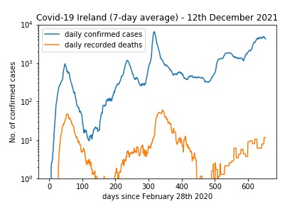
When I was updating my Covid-19 page today I thought I would try something a bit different. Here are the cases and deaths (in the form of 7-day rolling averages) as I usually plot them:

You can see a slight recent downturn – the latest 7-day average of new cases is 4214.3; it has been falling for a few days. A log plot like this shows up the changing ratio between deaths and cases quite well, as in l if you multiply a quantity by a factor that manifests itself as a constant shift upwards or downwards. There is clearly a bigger shift between the orange and blue curves after 500 days than there is, say, between, 300 and 400.

(I don’t think you can read much into the gap between the curves at the beginning (up to around 100 days in) as testing coverage was very poor then so cases were significantly underestimated.

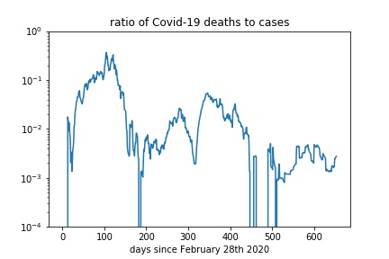
Anyway, to look at this a bit more clearly I plotted the ratio of daily reported deaths to daily confirmed cases over the course of the pandemic. This is the result:

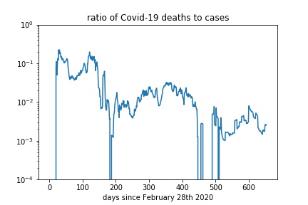
The sharp downward glitches occur whenever the number of reported deaths is zero, as log of zero is minus infinity. The broader downward feature after about 300 days represents the period in January 2021 when cases were climbing but deaths had not caught up. To deal with that I tried plotting the deaths recorded at a particular time divided by the cases two weeks earlier. This is that result:

The spike is still there, but is much decreased in size, suggesting that a two week lag between cases and deaths is a more useful ratio to look at. Note the ratio of deaths to cases is significantly lower from 500 days onwards than it was between 200 and 400 (say), by a factor a bit less than ten.

This obviously doesn’t translate into a direct measure of the efficacy of vaccines (not least because many of the recent cases and deaths are among the minority of unvaccinated people in Ireland) but it does demonstrate that there is a vaccine effect. Without them we would be having death rates up to ten times the current level for the same number of daily cases or, more likely, we would be in a strict lockdown.

On the other hand if cases do surge over the Christmas period there will still be a huge problem – 10 % of a large number is not zero.

Thoughts on Mortality

Posted in Covid-19 with tags , , , on September 2, 2020 by telescoper

I was updating my Covid-19 statistics page yesterday after the daily announcement and I noticed that it has now been ten consecutive days since the last Covid-19 related death in Ireland. As of yesterday there were only 40 people with Covid-19 in hospitals in the Republic, six of whom were in intensive care.

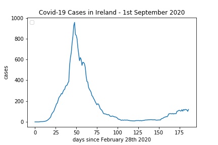
These low numbers are of course very good news indeed, but it got me wondering why. As you can see from the above graph, new cases started to increase about two months ago. In the first wave the mortality figures started to grow with a much shorter lag, although it is difficult to be too precise about it because of delays in testing and reporting that shifted the blue curve to the right.

With new cases in the Republic now appearing at an average rate of around 100 per day and assuming a mortality rate of a few percent, one might have expected to see the mortality figures rising, but this has not happened. It must be said though that the current level of new cases is much lower than the initial peak, as this linear plot (also smoothed on a 7-day window) makes clear:

An even more remarkable case is that of France (data from here):

The blue curve is a 7-day moving average. You can see that the level of new cases in France is about the same as it was in late March. The daily mortality figure however looks like this:

So the mortality rate among recent cases is much lower in France than in Ireland.

I’m not going to discuss mortality data in the United Kingdom as these are being fiddled by the Government who have arbitrarily decided not to count anyone who dies more than 4 weeks after testing positive for Covid-19 in the figures. It’s a blatant con intended to make people think that the situation in the UK is better than it actually is.

I suppose the main factor for this is that the more recent cases are not happening in hospitals or care homes and they are affecting mainly younger people who have no underlying health conditions; over 70% of the recent cases in Ireland are people under the age of 45. It may also be that the treatment of patients is more effective now that it was in March and April.

Some people are arguing on social media are saying that data such as these prove that the Coronavirus has lost its potency and is no longer a threat. In order to provide evidence in support of such a claim one would have to take account of the differences in demographic and health history of new cases versus older ones, and I have not seen such a study.

Update: I had a terrible feeling that this would happen, but the same day I wrote this a further Covid-19 related death was reported. This was however a late notification of a death that occurred in June. For the latest figures see here.