It’s been a while since I posted anything in the Bad Statistics folder. That’s not as if the present Covid-19 outbreak hasn’t provided plenty of examples, it’s that I’ve had my mind on other things. I couldn’t resist, however, sharing this cracker that I found on Twitter:
The paper concerned can be found here from which the key figure is this:
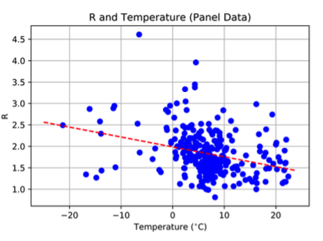
 This plots the basic reproductive rate R against temperature for Coronavirus infections from 100 Chinese cities. The argument is that the trend means that higher temperatures correspond to weakened transmission of the virus (as happens with influenza). I don’t know if this paper has been peer-reviewed. I sincerely hope not!
I showed this plot to a colleague of mine the other day who remarked “well, at least all the points lie on a plane”. It looks to me that if if you removed just one point – the one with R>4.5 – then the trend would vanish completely.
The alleged correlation is deeply unimpressive on its own, quite apart from the assumption that any correlation present represents a causative effect due to temperature – there could be many confounding factors.
P.S. Among the many hilarious responses on Twitter was this: