Archive for the Art Category

For Charity’s Sake…

Posted in Art, Biographical with tags , , on April 10, 2011 by telescoper

Our beautiful spring continues. It’s another lovely day here in Cardiff so I’m going to get some work done in the garden then catch up with the weekend’s crosswords. I was too busy yesterday to get round to the Saturday Guardian Prize Crossword, so now I’ve got it and the Observer ones to do today.

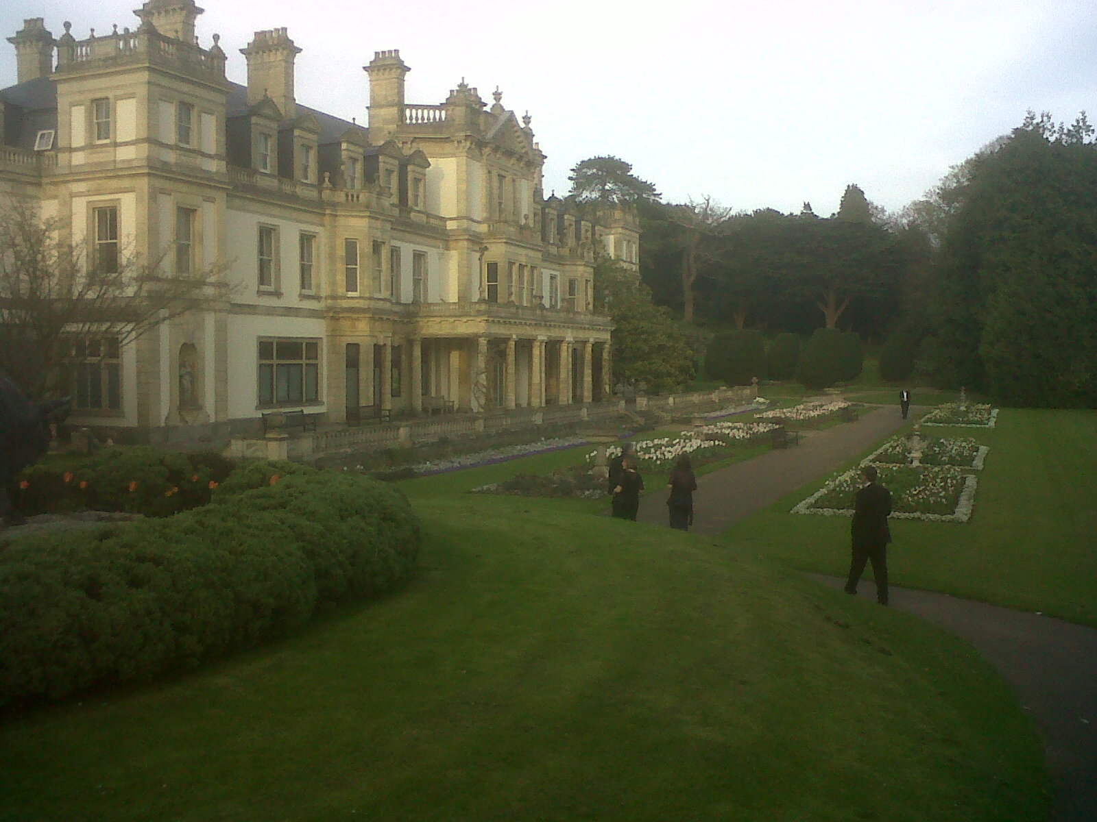
I went to a posh do last night. The Vale of Glamorgan County Council is renowned for the splendour of its Balls, and last night the Mayor held one of them for Charity. This event took place in a Marquee which had been specially erected in the magnificent setting of Dyffryn Gardens. I’ve never been there before, but am definitely planning togo again, as we didn’t get very much time to see the gardens and no time at all to see the famous arboretum there. Anyway, here’s a shot of us wandering around the (slightly dilapidated) Dyffryn House, which forms the centrepiece of the Dyffryn Estate, with champagne glasses in hand. How very decadent.

The Ball itself was very pleasant. The food was good, and there was plenty of wine to go around. The dance band was a little ropey, in my opinion, but plenty of people were dancing and it was all jolly good fun. Also I was one of the youngest people there, so it was quite nice, for once, not to be one of the oldies.

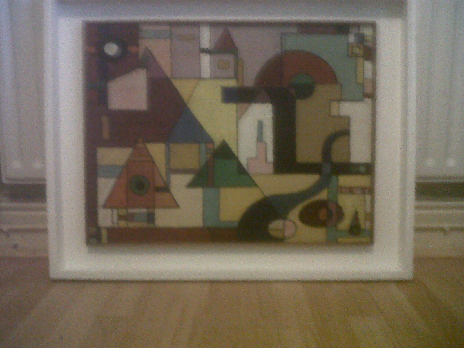
Since it was a fundraising event for Charity there was the obligatory raffle, followed by an auction. Among the items being sold were two paintings by local artist Charles Byrd. I ended up buying one of them, which happened to have been painted in 1963 – the year of my birth. I’m very pleased with my acquisition, but haven’t figured out where I’m going to hang it yet; here’s a blurry phone picture of it in my study.


Share/Bookmark

That Old “Two Cultures” Thing…

Posted in Art, Biographical, Education with tags , , , , , on March 20, 2011 by telescoper

Just a very brief follow-up to a post earlier this week about the 2nd Bright Club Wales. First, for all of you who refuse to believe I actually did stand-up, here is a picture of me doing it, i.e. standing up. It’s a bit blurred, I’m afraid. The person taking the picture must either have been drunk or was laughing so hysterically that he couldn’t hold the camera still. You can also find a review of the evening here, which is where I got the picture from.

I mentioned in the comments on the earlier posts that one of the other “acts” that evening was a lecturer in Film Studies. In fact that was a chap called Daryl Perrins who works at the University of Glamorgan.

He started his 8 minutes with the comment “I hate science” and followed it up with a number of unfunny remarks that relied on crude stereotypes of what a scientist is. None of that endeared him very much to me, nor, judging by the stony silence did the rest of the audience appreciate it much. I wouldn’t have minded him taking the piss out of scientists at all had it been funny. After all, I do a fair bit of that on here..

Anti-science attitudes are far from unusual amongst the Arts & Humanities fraternity, which I think is a real shame. After all, you’ll have to work very hard to find a scientist who would be prepared to stand up in front of audience and proudly announce “I hate art”. Many of my scientific colleagues have deep passions for the performing arts (especially music and drama) as well as being very well read across a wide range of subjects.  Many also hold strong  (and often idiosyncratic) political opinions and are involved in a huge range of activities outside science.

In short, scientists don’t just sit in their labs and offices torturing small animals. We live in the real world and have as much contact with wider society as anyone else. Imagination, creativity and free thinking can be found in scientists, just as they can in the arts.  Scientists both contribute to and participate in our society’s cultural heritage.Scientists are human beings. Culture belongs to us too.

Coincidentally this week there was an article in the Times Higher with the title “Life depends on science but the arts make it worth living“. I agree with a lot of what is written in the piece, in fact, although it does seem also to contain numerous examples of non sequitur and I think it’s both poorly argued and highly exaggerated. The arts are undoubtedly among the things that make  life worth living, but there are others, such as “ordinary” human relationships and the “simple” enjoyment of the natural world, which academics of all persuasions all too frequently neglect. I am a scientist, however, and I do think that the government should be spending more on science, but I certainly don’t think it should be robbing the arts and humanities which is what its current policies are doing.

You probably think I’m going to go off on a rant about the famous Two Cultures thesis advanced  by C.P. Snow, but I’m not. I think Snow’s analysis is only marginally relevant. I do think that there are “two cultures”, but these are not “science” and “the arts”. One is a creative, thinking culture that encompasses arts, the humanities and science. The other is its antithesis, a “culture” that sees the sole function of education as being to train people  to take their place on the never-ending treadmill of production and consumption.

The way we are heading, it’s not “two cultures” that we should be worried about. It’s no culture at all.


Share/Bookmark

Rapture

Posted in Art, The Universe and Stuff with tags , , on November 1, 2010 by telescoper

Glorious video of timelapse photography by, Tom Lowe, the winner of the 2010 Astronomy Photographer of the Year award.


Share/Bookmark

After Piero

Posted in Art, Education, Politics, The Universe and Stuff with tags , , , on October 31, 2010 by telescoper

I don’t often blog about things inspired from TV programmes. I don’t watch that many, and those I do see are rarely inspirational. However, last night, I caught the last of the series Renaissance Revolution, presented by Matthew Collings. It was on the subject of a major obsession of mine, the art of Piero della Francesca, and I thought it was wonderful. I regret having missed the previous programmes in the series, but I’m sure I’ll get a chance to see them sometime.

Collings focused on one particular painting by Piero, The Baptism of Christ, which hangs in the National Gallery in London, and which is illustrated below:

The political and religious backround to this painting are almost as fascinating as its composition, based on the offset superposition of a circle (representing heaven) and a square (representing the Earth). The use of perspective was very new around 1450 when this painting was finished, but that’s not the only geometrical aspect to note. There’s a striking use of symmetry (e.g. in the angles of John the Baptist’s arm and leg), and the central vertical axis defined by the dove, John’s hand and Christ’s hands.

Given the mathematical rigour of his compositional techniques, it should come as no surprise to learn that in his lifetime Piero was just as famous as a mathematician as he was as an artist. In other words he was the archetypal renaissance man. Unfortunately, most of his art doesn’t survive; the vast majority of his works were frescoes in various churches, few of which have withstood the test of time. Regrettably, little also is known about Piero the man, except that he lived into his 80s.

A while ago I mentioned another work by Piero which is the origin of my obsession with his paintings. The Flagellation of Christ is a work that has burrowed so far into my psyche that I quite often dream that I’m in the strange building depicted therein:
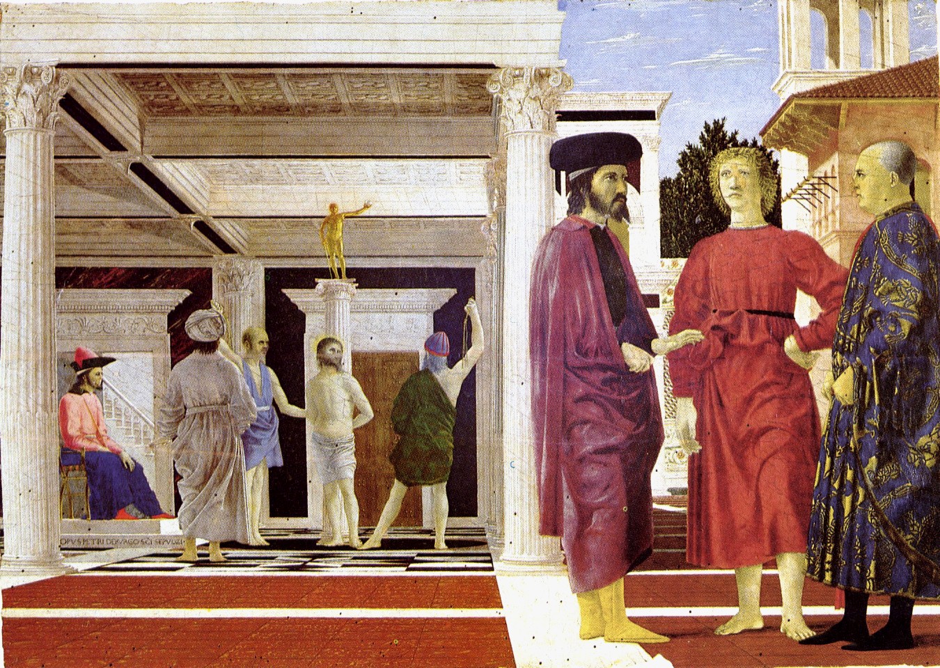
In fact I also use this painting in talks about science – I did so in my talk on Wednesday, in fact. The reason I use it in that context is that it is a bit like the standard model of cosmology. On one level it makes sense: the flat Euclidean geometry mapped out by the precise linear perspective allows us to understand the properties of the space extremely well, including the scale (the vanishing point indicates a front-to-back distance of about 250 ft). This is what our standard cosmology says too:- the universe also has a flat geometry. On the other hand, the more you think about the contents, the more confusing the picture gets. The main subject matter of the painting is to the left, in the background, playing an apparently minor part in the whole thing. Who are the characters surrounding the Christ figure? And who are the three figures in the foreground, dominating the whole composition, but seemingly indifferent to what is going on behind? Do they represent dark energy? Do the other characters represent the dark matter?

That’s not meant to be taken seriously, of course, and nobody actually knows what is really going on in this painting. It’s undoubtedly beautiful, but also an enigma, and that combination is what makes it a great work of art. It’s not easy to understand. It makes you wonder.That’s what science is like too. We have our theories, we have data, but there always remains a great deal we don’t understand. And sometimes the more we think about it, the more confused we get. Just as it is with that painting.

As Mark Collings put it brilliantly in the programme last night

When you’re looking at the picture, analysis isn’t exactly what is going on. You’re seeing and you’re getting pleasure from seeing. Partly the picture is telling you how pleasure is constructed, how it’s created, and partly you’re just lost in it. So when you’re lost in the light of Piero, you’re experiencing when you’ve forgotten how to experience. And you’re suddenly curious when you’ve forgotten how to be curious. And what you’re experiencing and being curious about is .. the world.

It doesn’t matter whether you’re a scientist or an artist (or a poet or a philosopher or a historian or whatever). The need to be curious about the world – or some aspect of it – is surely what it’s all about. During the Renaissance it wasn’t unusual for great minds to embrace science, mathematics and art – just think of Leonardo da Vinci. However, over the centuries we’ve become increasingly specialised and compartmentalised and more focused on making money than on making ideas. We’re losing what above all else is what makes us human, our curiosity.

Our society increasingly sees education simply as a means to develop skilled workers, smart enough to do technically complicated jobs, but not clever enough to ask too many questions about the materialistic treadmill they will spend their life upon. The UK government’s plan to withdraw funding for arts and humanities departments in universities is just another step along this path.

It shouldn’t be like this. Universities should be about learning for learning’s sake; not about teaching facts or skills, but about teaching people to ask questions and figure out their own answers. In other words, they should be about curiosity.

Share/Bookmark

Astronomy Photographer of the Year

Posted in Art, The Universe and Stuff with tags , , , on September 10, 2010 by telescoper

Amidst the doom and gloom of spending cuts and Ministerial incompetence we’re sometimes liable to forget what it’s all about. Last night provided us with a reminder, in the form of the Astronomy Photographer of the Year competition held at the National Maritime Museum (site of the Royal Observatory at Greenwich). There’s a varied selection of gorgeous entries on today’s Guardian, but this stunning image by Tom Lowe was the overall winner. Congratulations to him!


Share/Bookmark

The Sketch Process

Posted in Art, Education, The Universe and Stuff with tags , , , , , , , , , on August 25, 2010 by telescoper

It’s pouring with rain so, rather than set off home and get drenched, I thought I’d spend a few minutes on the blog and hope that the deluge dies down before I leave. Knowing my luck it will probably get worse.

Anyway, I thought I’d put together a short item on the theme of sketching. This is quite a strange subject for me to pick because drawing is something I’m completely useless at, but I hope you’ll bear with me and hopefully it will make some sense in the end.

What  spurred me on to think about it was the exhibit I’ve been involved with for the forthcoming Architecture Biennale in Venice as part of a project called Beyond Entropy organized by the Architectural Association School of Architecture. Unfortunately, although I’d originally planned to attend I can’t be there for the opening Symposium, but I hope it turns out to be as successful event as it promises to be!

Anyway, in the course of this project I came across this image of the Moon as drawn by Galileo

This led to an interesting discussion about the role of drawings like this in science. Of course  the use of sketches for the scientific representation of images has been superseded by photographic techniques, initially using film and more recently by digital techniques. The advantage of these methods is that they are quicker and also more “objective”. However, there are still many amateur astronomers who make drawings of the Moon as well as objects such as Jupiter and Saturn (which Galileo also drew). Moreover there are other fields in which experienced practioners continue to use pencil drawings in preference to photographic techniques. Archaeology provides many good examples, e.g.

The reason sketching still has a role in such fields is not that it can compete with photography for accuracy or objectivity but that there’s something about the process of sketching that engages the sketcher’s brain in a  way that’s very different from taking a photograph. The connection between eye, brain and hand seems to involve a cognitive element that is extremely useful in interpreting notes at a later date. In fact it’s probably their very subjectivity that makes them useful.  A thicker stroke of the pencil, or deliberately enhanced shading, or leaving out seemingly irrelevant detail, can help pick out  features that seem to the observer to be of particular significance. Months later when you’re trying to write up what you saw from your notes, those deliberate interventions against objectivity will take you back to what you  saw with your mind, not just with your eyes.

It doesn’t even matter whether or not you can draw well. The point isn’t so much to explain to other people what you’ve seen, but to record your own interaction with the object you’ve sketched in a way that allows you to preserve something more than a surface recollection.

You might think this is an unscientific thing to do, but I don’t think it is. The scientific process involves an interplay between objective reality and theoretical interpretation and drawing can be a useful part of this discourse. It’s as if the pencil allows the observer to interact with what is observed, forming a closer bond and probably a deeper level of understanding patterns and textures. I’m not saying it replaces a purely passive recording method like photography, but it can definitely help it.

I have not a shred of psychological evidence to back this up, but I’d also assert that sketching is very good for the learning process too.  Nowadays we tend to give out handouts of diagrams involved in physics, whether they relate to the design of apparatus or the geometrical configuration of a physical system. There’s a reason for doing this – they take a long time to draw and there’s a likelihood students will make mistakes copying them down. However, I’ve always  found that the only way to really take in what a diagram is saying is to try to draw it again myself. Even if the level of draftsmanship is worse, the level of understanding is undoubtedly better.Merely looking at someone else’s representation of something won’t give your brain as a good a feeling for what it is trying to say  as you would get if you tried to draw it yourself.

Perhaps what happens is that simply looking at a diagram only involves the connection between eye and brain. Drawing a copy requires also the connection between brain and hand. Maybe  this additional connection brings in additional levels of brain functionality. Sketching iinvolves your brain in an interaction that is different from merely looking.

The problem with excessive use of handouts – and this applies not only to figures  but also to lecture notes – is that they turn teaching into a very passive process. Taking notes in your own hand, and supplementing them with your own sketches – however scribbly and incomprehensible they may appear to other people – is  a much more active way to learn than collecting a stack of printed notes and meticulously accurate diagrams. And if it was good enough for Galileo, it should good enough for most of us!

Now it’s stopped raining so I’m off home!


Share/Bookmark

Crater 308

Posted in Art, The Universe and Stuff with tags , , , , , on August 1, 2010 by telescoper

I haven’t got time to post much today – WordPress was down earlier when I had a bit of time and now I’m going to watch the highlights of England’s Test victory against Pakistan in the cricket today, which they achieved by bowling out their opponents for only 80 runs in the second innings.

Nevertheless, as a quick filler, I thought it would be nice to show this wonderful image of the crater Daedalus, formerly known as Crater 308, which is located on the far side of the Moon. Not the dark side, by the way, the far side of the Moon gets just as much sunlight as the near side!
This is one of the images I’ve been working on as part of the project Beyond Entropy for a forthcoming exhibit at the Venice Biennale of Architecture which opens at the end of this month. I won’t say too much about the exhibit I’m involved with, except that it explores the way higher-dimensional information can be recorded in surfaces of lower dimension, like a kind of architectural holographic principle. I was particularly struck by the way the pattern of cratering on the Moon yields information about its formation history, which is why I went looking for dramatic examples. This – taken during the Apollo 11 mission- is my favourite image of all those I’ve looked at. I love the complexy topography, its textural contrasts and the way the shadows play across it.

Daedalus is an impact crater that formed about 3.75 to 3.2 bn years ago. It’s about 93km across. The crater looks relatively fresh; showing sharp-ish-looking rims all around with sequences of wonderfully-preserved terraces down onto a pock-marked, flat floor consisting of numerous craterlets and a central peak divided up into two to three well-defined hills. You can also see the effect of more recent impacts in and around it.

Talking of impact, I wonder if I can get this project into our REF submission?

“The Greatest Picture of the War”

Posted in Art with tags , , , , on July 11, 2010 by telescoper

This remarkable photograph was taken at 8.32am on 6th June 1944 on “Queen Red” beach, a sector in the centre-left of  Sword Area, during the early stages of the D-Day invasion. The precise location is near La Brèche, Hermanville-sur-Mer, Normandy. The shutter clicked just as the beach came under heavy artillery and mortar fire from powerful German divisions inland.

I came across a discussion of this image in today’s Observer and decided to post it here, simply because it’s such a great  composition. As the article describes, it consists of “a series of tableaux that look like quotations from religious art”.  The piece goes on

In the foreground and on the right are sappers of 84 Field Company Royal Engineers. Behind them, heavily laden medical orderlies of 8 Field Ambulance Royal Army Medical Corps (some of whom are treating wounded men) prepare to move off the beach. In the background, men of the 1st Battalion, the Suffolk Regiment and No 4 Army Commando swarm ashore from landing craft.

The sapper in the bottom left, looking directly into the camera, looks terrified, and his expression makes it seem like he’s trying to escape from the photograph; through his eyes we get a glimpse of the shocking reality of armed conflict, which is far from the romantic way it’s portrayed in the movies. His colleague, turning away from the lens, seems to be calling to the men behind, but the image of his head and upper body links with the more distant figures forming a dramatic arc that pulls you into the centre of the picture before veering off to the right. Each element of this  image tells its own story, but apart from one person in the foreground, all the faces are all hidden from view. I’m sure these anonymous figures were all just as frightened as the man in the foreground, but their individual identities are lost as they blend into graphic depiction of the monumental scale of the invasion. It’s a truly wonderful work of art, and a brilliant piece of storytelling, at the same level as an Old Master, but this is made all the more remarkable by the fact that the photographer was risking his life to take this picture.

This photograph, which was taken by Sergeant Jim Mapham of the Army Film and Photography Unit, was described by the US Press as “the greatest picture of the war”.

Jim Mapham was one of seven cameramen of the AFPU who went in on D-Day: Sgt Ian Grant, Sgt Christie, Sgt Norman Clague (killed), Sgt Desmond O’Neill (wounded), Sgt Billie Greenhalgh (wounded) and Sgt George Laws. Their work forms an extraordinary record of the invasion and is still widely used by the media – but rarely credited.

Robert Capa, the famous Hungarian photographer, was also on the beaches that morning, pinned down in the waves by enemy fire. But while he clambered on to a landing craft to get his pictures back to London, Sgt Mapham moved inland with the invasion force…

Jim Mapham survived the D-Day campaign and entered Germany with the army to document the fall of the Third Reich and the horrors of the Belsen concentration camp. He died in 1968. Until today I’d never heard of him. His name should be much more widely celebrated. I understand that the complete set of photographs he took on D-Day can be found in the Imperial War Museum‘s photographic archive.

As a final comment let me add that, contrary to popular myth, the landings at the Sword beaches were by no means a pushover. It’s true that the American forces, especially at Omaha beach, suffered heavier casualties on the actual landings – primarily because they failed to get their tanks and heavy artillery pieces ashore. However, the British troops at Sword were the only ones at any of the five landing areas to encounter strong German Panzer divisions on D-Day. The main assault force at Sword beach was the British 3rd Infantry Division and its primary objective on the day of the invasion was to capture the city of Caen. As it turned out, the fighting was so heavy that they didn’t manage to take Caen until almost a month after D-Day.

European Echoes

Posted in Art, Jazz with tags , , , on July 8, 2010 by telescoper

This is  something I found recently and couldn’t resist sharing. This track from Ornette Coleman has only been on Youtube a month or so and I just found it last night, but I’ve got it on a vinyl LP I bought about 30 years ago. I think the music is completely wonderful on its own, but the idea of accompanying it with examples of the art of Joan Miro was a brilliant one!

European Echoes was recorded live at the Golden Circle club in Stockholm  in 1965, and is part of a famous album that was proclaimed “Record of the Year” the following summer in Downbeat magazine. By the mid-60s Ornette Coleman had already established his reputation as leading light of avant-garde saxophonists and, in his own way, was as great an influence on jazz as Charlie Parker, Sonny Rollins and John Coltrane had been earlier.

The track features a trio of Coleman on alto sax, David Izenzon on bass, and Charles Moffit on bass. It starts in a deceptively simple manner, with Ornette’s little two-note statements over a fast waltzy 3/4 foundation provided by Izenzon and Moffitt. It then eases into  a passage marked by freer improvisations by Ornette, the meter changing at the same time to 4/4. Ornette plays for more than half the track, after which Izenzon and Moffitt take over for all but the final minute, at which point Izenzon drops out and Moffitt plays an intricate percussion solo.

Although most people I know recognize the virtuosity of modern jazz musicians they don’t really like the music very much. I fell in love with this track as soon as I heard it, partly because it begins simply enough for a beginning saxophonist to play along with, but also because it’s highly original without being  at all self-indulgent. In fact, at one level, everything Ornette Coleman  does on this track is quite simple; he plays the saxophone here like he’d just invented the instrument.  In fact, at least in his early years, he didn’t have much of a technique at all in the conventional sense but nevertheless managed to produce amazingly fresh sounds. This a view echoed by the great Charles Mingus in quote I got from another blog about Ornette Coleman

Now aside from the fact that I doubt he can even play a C scale in whole notes—tied whole notes, a couple of bars apiece—in tune, the fact remains that his notes and lines are so fresh. So when [the jazz dj] Symphony Sid played his record, it made everything else he was playing, even my own record that he played, sound terrible.

I did learn to enjoy and admire Ornette Coleman’s more “difficult” music later on, but this was the track that convinced me that Ornette Coleman was a genius.  I hope to get the time over the summer to write a few more posts in appreciation of my favourite jazz artists, but for the time being I’ll just let this piece speak for itself…

All in a day’s work

Posted in Art, Biographical, Education, Science Politics, The Universe and Stuff with tags , , , , , on June 30, 2010 by telescoper

I got back from yesterday’s trip to a very muggy London with a raging sore throat and a brain as sluggish as an England defender on an action replay. Come to think of it, I must be as sick as a parrot. I’m sweating like a pig too, although I don’t know whether that’s a symptom of anything nasty or just because it’s still so warm and humid. Anyway, in view of my likely incoherence I thought I’d keep it brief (again) and just mention a few salient points from the last day or two.

I went to London as part of my duties as External Examiner for the MSc Course in Astrophysics at Queen Mary, University of London. Of course all the proceedings are confidential so I’m not going to comment on anything in detail, except that I spent a bit of time going through the exam scripts before the Examiners’ Meeting in a room that did a very passable impersonation of a heat bath. When I was later joined by the rest of the Exam Board the temperature soared still further. Fortunately the business went relatively smoothly so nobody got too hot under the collar and after concluding the formal business, a few of us cooled off with a beer or two in the Senior Common Room.The students spend the next couple of months writing their dissertations now that the written exams are over, so we have to reconvene in October to determine the final results. I hope it’s a bit cooler by then.

I couldn’t stay long at Queen Mary, however, as I had a working dinner to get to. Regular readers of this blog (both of them) may remember that I’m involved in project called Beyond Entropy which is organized by the Architectural Association School of Architecture. I’ve been working on this occasionally over the months that have passed since I first blogged about it, but deadlines are now looming and we need to accelerate our activity. Last night I met with the ever-enthusiastic Stefano Rabolli Pansera at the house of Eyal Weizman by Victoria Park in the East End, handily close to Queen Mary’s Mile End campus. Assisted by food and wine we managed to crystallise our ideas into something much more tangible than we had managed to do before on our theme of Gravitational Energy. The School has offered us expert practical assistance in making prototypes and  I’m now much more optimistic about our exhibit coming together, not to mention excited at the prospect of seeing it on display at the Venice Architecture Biennale. I won’t say what we’re planning just yet, though. I’d rather wait until it’s done before unveiling it.

Incidentally, here’s a link to a  lecture by Eyal Weizman where he gives some interesting perspectives on architectural history.

Finally, and nothing to do with my trip to the Big Smoke, I noticed today on the Research Fortnight Blog that the Higher Education Funding Council for Wales (HEFCW) is planning to reduce the number of universities in Wales “significantly” from its current level of 12. This is an interesting development and one that I’ve actually argued for here. Quoting Leighton Andrews, Welsh Assembly Minister responsible for higher education, the piece says

“This target does not mean fewer students,” he said in a statement. “But it is likely to mean fewer vice chancellors. We will have significantly fewer HE institutions in Wales but they will be larger and stronger.”

How these reductions will be achieved remains to be seen, but it seems obvious that quite a few  feathers will be ruffled among the management’s plumage in some institutions and it looks like some vice chancellors will be totally plucked!