How many things are wrong about this graphic?
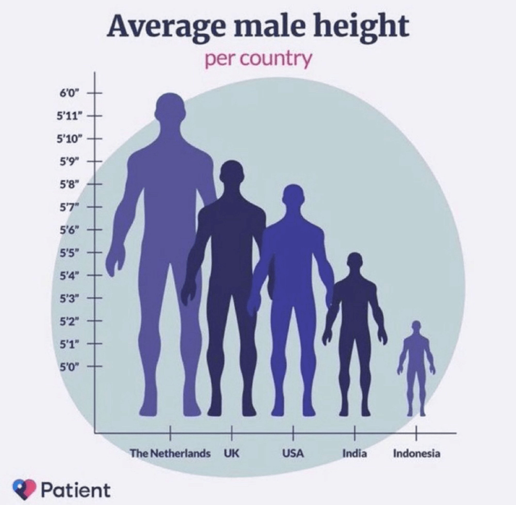
How many things are wrong about this graphic?
Dear Rankers,
I note with interest that you have announced significant changes to the methodology deployed in the construction of this years forthcoming league tables. I would like to ask what steps you will take to make it clear to that any changes in institutional “performance” (whatever that is supposed to mean) could well be explained simply by changes in the metrics and how they are combined?,
I assume, as intelligent and responsible people, that you did the obvious test for this effect, i.e. to construct and publish a parallel set of league tables, with this year’s input data but last year’s methodology, which would make it easy to isolate changes in methodology from changes in the performance indicators. This is a simple test that anyone with any scientific training would perform.
You have not done this on any of the previous occasions on which you have introduced changes in methodology. Perhaps this lamentable failure of process was the result of multiple oversights. Had you deliberately withheld evidence of the unreliability of your conclusions you would have left yourselves open to an accusation of gross dishonesty, which I am sure would be unfair.
Happily, however, there is a very easy way to allay the fears of the global university community that the world rankings are being manipulated. All you need to do is publish a set of league tables using the 2022 methodology and the 2023 data. Any difference between this table and the one you published would then simply be an artefact and the new ranking can be ignored.
I’m sure you are as anxious as anyone else to prove that the changes this year are not simply artificially-induced “churn”, and I look forward to seeing the results of this straightforward calculation published in the Times Higher as soon as possible, preferably next week when you announce this years league tables.
I look forward to seeing your response to the above through the comments box, or elsewhere. As long as you fail to provide a calibration of the sort I have described, this year’s league tables will be even more meaningless than usual. Still, at least the Times Higher provides you with a platform from which you can apologize to the global academic community for wasting their time and that of others.
I was just thinking this morning that it’s been a while since I posted anything in my Bad Statistics folder when suddenly I come across this gem from a paper in Nature Astronomy entitled Could quantum gravity slow down neutrinos?
The paper itself is behind a paywall (though a preprint version is on the arXiv here). The results in the paper were deemed so important that Nature Astronomy tweeted about them, including this remarkable graph:

Understandably there has been quite a lot of reaction from scientists on Twitter to this plot, questioning how the blue line is obtained from the dots (as only one point to the right appears to be responsible for the trend), remarking on the complete absence of any error bars on either axis for any of the points, and above all wondering how this managed to get past a referee, never mind one for a “prestigious” journal such as Nature Astronomy. It wouldn’t have passed muster as an undergraduate exercise.
Of course this is how a proper astronomer would do it:
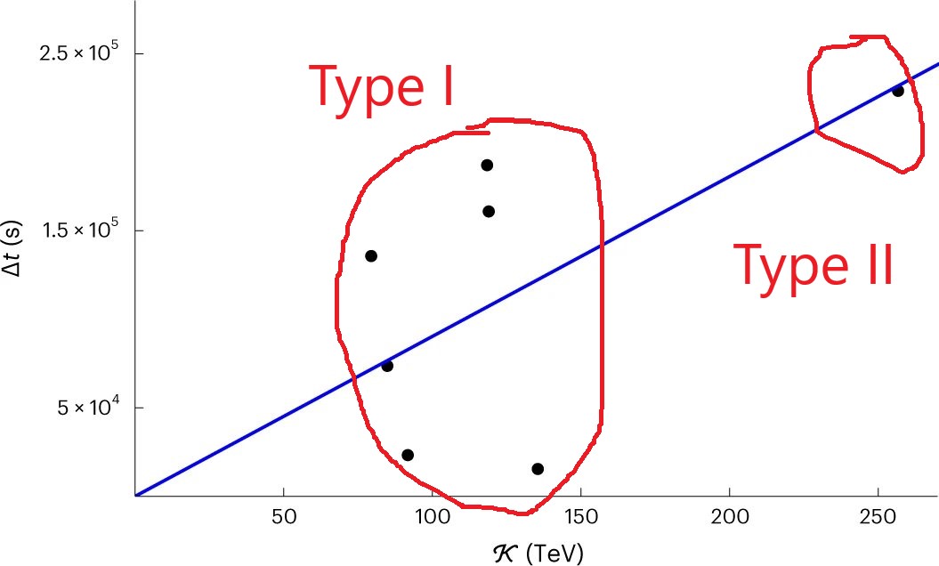
Joking aside, if you look at the paper (or the preprint if you can’t afford it) you will see another graph, which shows two other points at higher energy (red triangles):

The extra two points don’t have any error-bars either, and according to the preprint these appear to be unconfirmed candidate GRB events.
The abstract of the paper is:
In addition to its implications for astrophysics, the hunt for neutrinos originating from gamma-ray bursts could also be significant in quantum-gravity research, as they are excellent probes of the microscopic fabric of spacetime. Some previous studies based on neutrinos observed by the IceCube observatory found intriguing preliminary evidence that some of them might be gamma-ray burst neutrinos whose travel times are affected by quantum properties of spacetime that would slow down some of the neutrinos while speeding up others. The IceCube collaboration recently significantly revised the estimates of the direction of observation of their neutrinos, and we here investigate how the corrected directional information affects the results of the previous quantum-spacetime-inspired analyses. We find that there is now little evidence for neutrinos being sped up by quantum spacetime properties, whereas the evidence for neutrinos being slowed down by quantum spacetime is even stronger than previously determined. Our most conservative estimates find a false-alarm probability of less than 1% for these ‘slow neutrinos’, providing motivation for future studies on larger data samples.
I agree with the last sentence where it says larger data samples are needed in future, but also I’d suggest higher standards of data analysis are also called for. Not to mention refereeing. After all, it’s the quality of the reviewing that you pay for, isn’t it?
P.S. For those of you wondering, this paper would not have been published by the Open Journal of Astrophysics even if passed review, as it is not on the astro-ph section of arXiv (it’s on gr-qc).
After last night’s Eurovision 2023 extravaganza I thought I’d work off my hangover by summarizing the voting. The vote is split into 50% jury votes and 50% televotes from audiences sitting at home, drunk. It’s perhaps worth mentioning that the juries do their scores based on the dress rehearsals on Friday so they are not based on the performances the viewers see.
Each country/jury has 58 points to award, shared among 10 countries: 1-8, 10 and 12 for the top score. Countries that didn’t make it to the final (e.g. Ireland) also get to vote. For the televotes only there is also a “rest-of-the-world” vote for non-Eurovision countries.
This system can deliver very harsh results because only 10 songs can get points from a given source. It’s possible to be judged the 11th best across the board and score nil!
Here are the final scores in a table:
| Rank | Country | Overall | Televotes | Jury | Diff | Rank Diff |
| 1 | Sweden | 583 | 243 | 340 | +97 | +1 |
| 2 | Finland | 526 | 376 | 150 | -226 | -1 |
| 3 | Israel | 362 | 185 | 177 | -8 | +3 |
| 4 | Italy | 350 | 174 | 176 | +2 | +3 |
| 5 | Norway | 268 | 216 | 52 | -168 | -14 |
| 6 | Ukraine | 243 | 189 | 54 | -145 | -11 |
| 7 | Belgium | 182 | 55 | 127 | +72 | +5 |
| 8. | Estonia | 168 | 22 | 146 | +124 | +14 |
| 9. | Australia | 151 | 21 | 130 | +109 | +14 |
| 10. | Czechia | 129 | 35 | 94 | +59 | +7 |
| 11. | Lithuania | 127 | 46 | 81 | +35 | +4 |
| 12. | Cyprus | 126 | 58 | 68 | +10 | -2 |
| 13. | Croatia | 123 | 112 | 11 | -101 | -18 |
| 14. | Armenia | 122 | 53 | 69 | +16 | +1 |
| 15. | Austria | 120 | 16 | 104 | +88 | +13 |
| 16. | France | 104 | 50 | 54 | +4 | -2 |
| 17. | Spain | 100 | 5 | 95 | +90 | +17 |
| 18. | Moldova | 96 | 76 | 20 | -56 | -11 |
| 19. | Poland | 93 | 81 | 12 | -69 | -16 |
| 20. | Switzerland | 92 | 31 | 61 | +30 | +4 |
| 21. | Slovenia | 78 | 45 | 33 | -12 | -3 |
| 22. | Albania | 76 | 59 | 17 | -42 | -11 |
| 23. | Portugal | 59 | 16 | 43 | +27 | +4 |
| 24. | Serbia | 30 | 16 | 14 | +2 | 0 |
| 25. | United Kingdom | 24 | 9 | 22 | +13 | 0 |
| 26. | Germany | 18 | 15 | 3 | -12 | -2 |
Going into the last allocation of televotes, Finland were in in the lead thanks to their own huge televote, but Sweden managed to win despite a lower televote allocation because of their huge score on the jury votes. Had the scores been based on the jury votes alone, Sweden would have won by a mile, and if only on the televotes Finland would have won. Anyway, rules is rules…
There are some interestingly odd features in the above dataset. For example, Switzerland ranked 20th overall, but were ranked 18th and 14th by televotes and jury votes respectively. There are also cases in which a higher score in one set of votes leads to a lower rank, and vice-versa. Croatia were hammered by the jury votes, ranking 25th out of 26 on that basis but would have been 7th based on televotes alone; hence their -18 in the last column. A similar fate befell Norway. By contrast, Spain were last (26th) on the televotes but placed 9th in the pecking order by the juries; they ended up in 17th place.
Anyway, you can see that there are considerable differences between the scores and ranks based on the public vote and the jury votes. I have therefore deployed my vast knowledge of statistics to calculate the Spearman Rank Correlation Coefficient between the ranks based on televotes only and based on jury votes only. The result is 0.26. Using my trusty statistical tables, noting that n=26, and wearing a frequentist hat for simplicity, I find that there is no significant evidence for correlation between the two sets of ranks. I can’t say I’m surprised.
The apparent randomness of the scoring process introduces a considerable amount of churn into the system, as demonstrated by Mel Giedroyc in this, the iconic image of last night’s events.
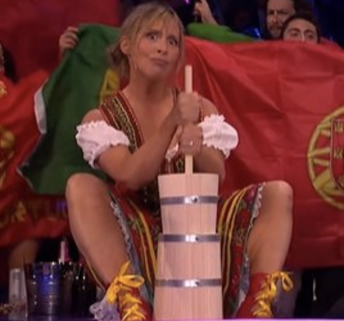
At least I think that’s what she’s doing…
Anyway, for the record, I should say that my favourite three songs were Albania (22nd), Portugal (23rd) and Austria (15th). Maybe one day I’ll pick a song that makes it onto the left-hand half of the screen!
P.S. Eurovision 2024 will be in Sweden, which is nice because it will be the 50th anniversary of ABBA winning with Waterloo. I’ll never tire of boring people with the fact that a mere 15 years after ABBA won, I walked across the very same stage at the Brighton Centre to collect my doctorate from Sussex University…
I was surprised today that some students I was talking to couldn’t identify the leading American philosopher and social scientist responsible for this pithy summation of the limits of human knowledge:
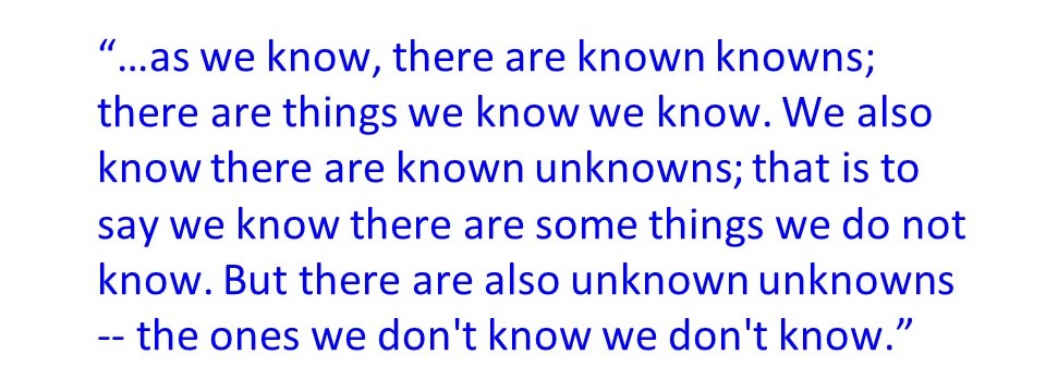
Obviously it’s from before their time. How about you? Without using Google, can you identify the origin of this clear and insightful description?
I’ve just finished reading an interesting paper by Secrest et al. which has attracted some attention recently. It’s published in the Astrophysical Journal Letters but is also available on the arXiv here. I blogged about earlier work by some of these authors here.
The abstract of the current paper is:
We present the first joint analysis of catalogs of radio galaxies and quasars to determine if their sky distribution is consistent with the standard ΛCDM model of cosmology. This model is based on the cosmological principle, which asserts that the universe is statistically isotropic and homogeneous on large scales, so the observed dipole anisotropy in the cosmic microwave background (CMB) must be attributed to our local peculiar motion. We test the null hypothesis that there is a dipole anisotropy in the sky distribution of radio galaxies and quasars consistent with the motion inferred from the CMB, as is expected for cosmologically distant sources. Our two samples, constructed respectively from the NRAO VLA Sky Survey and the Wide-field Infrared Survey Explorer, are systematically independent and have no shared objects. Using a completely general statistic that accounts for correlation between the found dipole amplitude and its directional offset from the CMB dipole, the null hypothesis is independently rejected by the radio galaxy and quasar samples with p-value of 8.9×10⁻³ and 1.2×10⁻⁵, respectively, corresponding to 2.6σ and 4.4σ significance. The joint significance, using sample size-weighted Z-scores, is 5.1σ. We show that the radio galaxy and quasar dipoles are consistent with each other and find no evidence for any frequency dependence of the amplitude. The consistency of the two dipoles improves if we boost to the CMB frame assuming its dipole to be fully kinematic, suggesting that cosmologically distant radio galaxies and quasars may have an intrinsic anisotropy in this frame.
I can summarize the paper in the form of this well-worn meme:
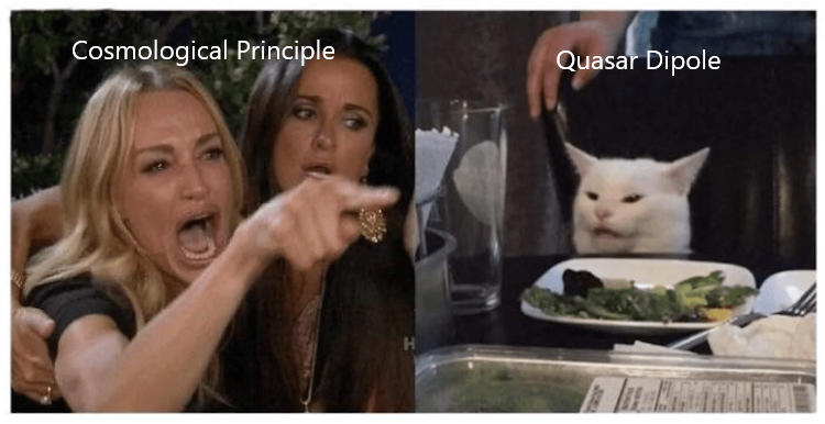
My main reaction to the paper – apart from finding it interesting – is that if I were doing this I wouldn’t take the frequentist approach used by the authors as this doesn’t address the real question of whether the data prefer some alternative model over the standard cosmological model.
As was the case with a Nature piece I blogged about some time ago, this article focuses on the p-value, a frequentist concept that corresponds to the probability of obtaining a value at least as large as that obtained for a test statistic under a particular null hypothesis. To give an example, the null hypothesis might be that two variates are uncorrelated; the test statistic might be the sample correlation coefficient r obtained from a set of bivariate data. If the data were uncorrelated then r would have a known probability distribution, and if the value measured from the sample were such that its numerical value would be exceeded with a probability of 0.05 then the p-value (or significance level) is 0.05. This is usually called a ‘2σ’ result because for Gaussian statistics a variable has a probability of 95% of lying within 2σ of the mean value.
Anyway, whatever the null hypothesis happens to be, you can see that the way a frequentist would proceed would be to calculate what the distribution of measurements would be if it were true. If the actual measurement is deemed to be unlikely (say that it is so high that only 1% of measurements would turn out that large under the null hypothesis) then you reject the null, in this case with a “level of significance” of 1%. If you don’t reject it then you tacitly accept it unless and until another experiment does persuade you to shift your allegiance.
But the p-value merely specifies the probability that you would reject the null-hypothesis if it were correct. This is what you would call making a Type I error. It says nothing at all about the probability that the null hypothesis is actually a correct description of the data. To make that sort of statement you would need to specify an alternative distribution, calculate the distribution based on it, and hence determine the statistical power of the test, i.e. the probability that you would actually reject the null hypothesis when it is incorrect. To fail to reject the null hypothesis when it’s actually incorrect is to make a Type II error.
If all this stuff about p-values, significance, power and Type I and Type II errors seems a bit bizarre, I think that’s because it is. In fact I feel so strongly about this that if I had my way I’d ban p-values altogether…
This is not an objection to the value of the p-value chosen, and whether this is 0.005 rather than 0.05 or, , a 5σ standard (which translates to about 0.000001! While it is true that this would throw out a lot of flaky ‘two-sigma’ results, it doesn’t alter the basic problem which is that the frequentist approach to hypothesis testing is intrinsically confusing compared to the logically clearer Bayesian approach. In particular, most of the time the p-value is an answer to a question which is quite different from that which a scientist would actually want to ask, which is what the data have to say about the probability of a specific hypothesis being true or sometimes whether the data imply one hypothesis more strongly than another. I’ve banged on about Bayesian methods quite enough on this blog so I won’t repeat the arguments here, except that such approaches focus on the probability of a hypothesis being right given the data, rather than on properties that the data might have given the hypothesis.
Not that it’s always easy to implement the (better) Bayesian approach. It’s especially difficult when the data are affected by complicated noise statistics and selection effects, and/or when it is difficult to formulate a hypothesis test rigorously because one does not have a clear alternative hypothesis in mind. That’s probably why many scientists prefer to accept the limitations of the frequentist approach than tackle the admittedly very challenging problems of going Bayesian.
But having indulged in that methodological rant, I certainly have an open mind about departures from isotropy on large scales. The correct scientific approach is now to reanalyze the data used in this paper to see if the result presented stands up, which it very well might.
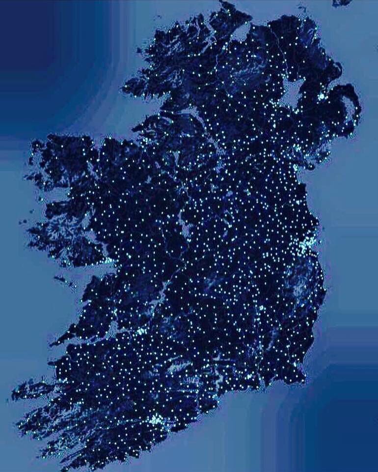
The above picture was doing the rounds on Twitter yesterday ahead of this year’s All-Ireland Football Final at Croke Park (won by favourites Kerry despite a valiant effort from Galway, who led for much of the game and didn’t play at all like underdogs).
The picture above shows the distribution of Gaelic Athletics Association (GAA) grounds around Ireland. In case you didn’t know, Hurling and Gaelic Football are played on the same pitch with the same goals and markings on the field. First thing you notice is that the grounds are plentiful! Obviously the distribution is clustered around major population centres – Dublin, Cork, Limerick and Galway are particularly clear – but other than that the distribution is quite uniform, though in less populated areas the grounds tend to be less densely packed.
The eye is also drawn to filamentary features, probably related to major arterial roads. People need to be able to get to the grounds, after all. Or am I reading too much into these apparent structures? The eye is notoriously keen to see patterns where none really exist, a point I’ve made repeatedly on this blog in the context of galaxy clustering.
The statistical description of clustered point patterns is a fascinating subject, because it makes contact with the way in which our eyes and brain perceive pattern. I’ve spent a large part of my research career trying to figure out efficient ways of quantifying pattern in an objective way and I can tell you it’s not easy, especially when the data are prone to systematic errors and glitches. I can only touch on the subject here, but to see what I am talking about look at the two patterns below:
You will have to take my word for it that one of these is a realization of a two-dimensional Poisson point process and the other contains correlations between the points. One therefore has a real pattern to it, and one is a realization of a completely unstructured random process.
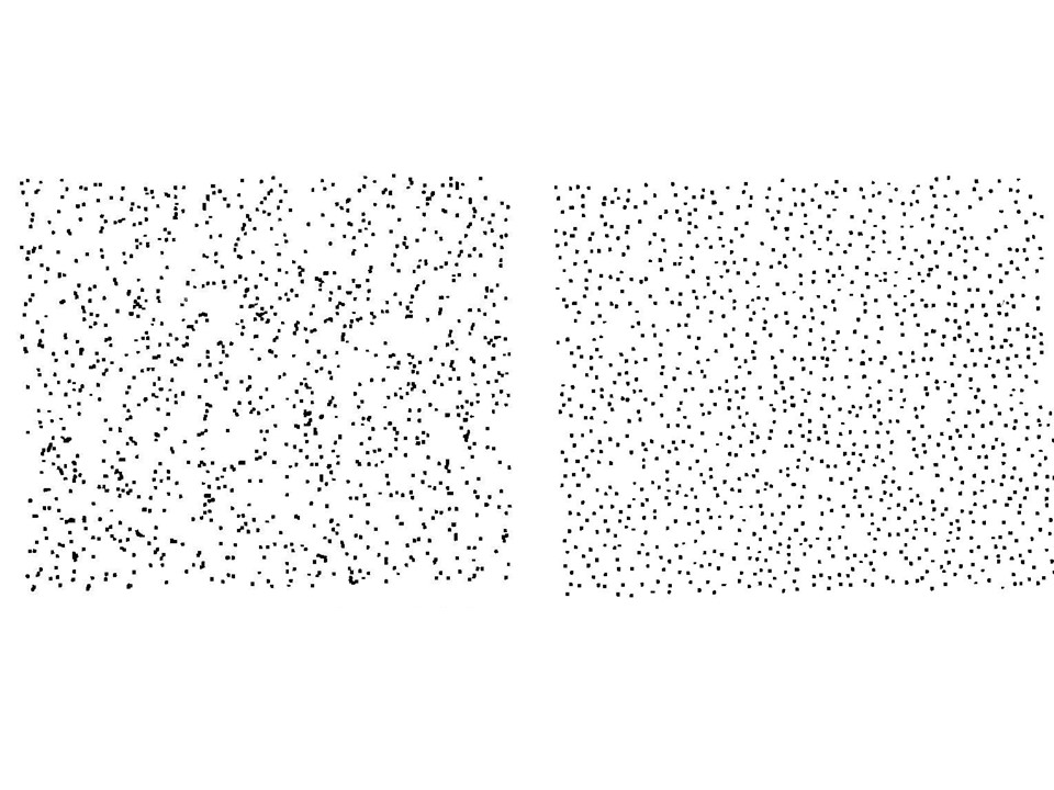
I show this example in popular talks and get the audience to vote on which one is the random one. The vast majority usually think that the one on the right that is random and the one on the left is the one with structure to it. It is not hard to see why. The right-hand pattern is very smooth (what one would naively expect for a constant probability of finding a point at any position in the two-dimensional space) , whereas the left-hand one seems to offer a profusion of linear, filamentary features and densely concentrated clusters.
In fact, it’s the picture on the left that was generated by a Poisson process using a Monte Carlo random number generator. All the structure that is visually apparent is imposed by our own sensory apparatus, which has evolved to be so good at discerning patterns that it finds them when they’re not even there!
The right-hand process is also generated by a Monte Carlo technique, but the algorithm is more complicated. In this case the presence of a point at some location suppresses the probability of having other points in the vicinity. Each event has a zone of avoidance around it; the points are therefore anticorrelated. The result of this is that the pattern is much smoother than a truly random process should be. In fact, this simulation has nothing to do with galaxy clustering really. The algorithm used to generate it was meant to mimic the behaviour of glow-worms which tend to eat each other if they get too close. That’s why they spread themselves out in space more uniformly than in the random pattern.
Incidentally, I got both pictures from Stephen Jay Gould’s collection of essays Bully for Brontosaurus and used them, with appropriate credit and copyright permission, in my own book From Cosmos to Chaos.
The tendency to find things that are not there is quite well known to astronomers. The constellations which we all recognize so easily are not physical associations of stars, but are just chance alignments on the sky of things at vastly different distances in space. That is not to say that they are random, but the pattern they form is not caused by direct correlations between the stars. Galaxies form real three-dimensional physical associations through their direct gravitational effect on one another.
People are actually pretty hopeless at understanding what “really” random processes look like, probably because the word random is used so often in very imprecise ways and they don’t know what it means in a specific context like this. The point about random processes, even simpler ones like repeated tossing of a coin, is that coincidences happen much more frequently than one might suppose.
I suppose there is an evolutionary reason why our brains like to impose order on things in a general way. More specifically scientists often use perceived patterns in order to construct hypotheses. However these hypotheses must be tested objectively and often the initial impressions turn out to be figments of the imagination, like the canals on Mars.
For no other reason that I was a bit bored watching the FA Cup Final on Saturday I decided to construct an alternative to the Research Excellence Framework rankings for Physics produced by the Times Higher last week.
The table below shows for each Unit of Assessment (UoA): the Times Higher rank; the number of Full-Time Equivalent staff submitted; the overall percentage of the submission rated 4*; and the number of FTE’s worth of 4* stuff (final column), by which the institutions are sorted. The logic for this – insofar as there is any – is that the amount of money allocated is probably going to be more strongly weighted to 4* (though not perhaps the 100% I am effectively assuming) than the GPA used in the Times Higher.
| 1. University of Oxford | 9= | 171.3 | 57 | 97.6 |
| 2. University of Cambridge | 3 | 148.2 | 64 | 94.8 |
| 3. Imperial College | 18= | 130.1 | 49 | 63.7 |
| 4. University of Edinburgh | 13= | 118.0 | 51 | 60.2 |
| 5. University of Manchester | 2 | 87 | 66 | 57.4 |
| 6. University College London | 24= | 112.5 | 42 | 47.3 |
| 7. University of Durham | 23 | 84.2 | 45 | 37.9 |
| 8. University of Nottingham | 7 | 63.9 | 59 | 37.7 |
| 9. University of Warwick | 20 | 79.2 | 47 | 37.2 |
| 10. University of Birmingham | 4 | 55.2 | 66 | 36.4 |
| 11. University of Bristol | 5 | 54.1 | 61 | 33.0 |
| 12. University of Glasgow | 12 | 58.2 | 53 | 30.8 |
| 13. University of York | 13= | 59.9 | 51 | 30.5 |
| 14. University of Lancaster | 21 | 56.1 | 46 | 25.8 |
| 15. University of Strathclyde | 13= | 46.7 | 52 | 24.3 |
| 16. Cardiff University | 18= | 52.2 | 46 | 24.0 |
| 17. University of Exeter | 22 | 49.4 | 48 | 23.7 |
| 18. University of Sheffield | 1 | 34.7 | 65 | 22.5 |
| 19. University of St Andrews | 8 | 40.8 | 55 | 22.4 |
| 20. University of Liverpool | 16 | 44.4 | 49 | 21.7 |
| 21. University of Leeds | 9= | 34 | 53 | 18.0 |
| 22. University of Sussex | 26 | 42.7 | 42 | 17.9 |
| 23. The University of Bath | 24= | 38.8 | 42 | 16.3 |
| 24. Queen’s University of Belfast | 31 | 49.7 | 32 | 15.9 |
| 25. Queen Mary University of London | 28= | 48 | 33 | 15.8 |
| 26, University of Southampton | 27 | 41.7 | 38 | 15.8 |
| 27. The Open University | 32= | 41.8 | 36 | 15.0 |
| 28. University of Hertfordshire | 38 | 42 | 32 | 13.4 |
| 29. Liverpool John Moores University | 17 | 25.8 | 50 | 12.9 |
| 30. Heriot-Watt University | 9= | 21 | 55 | 11.6 |
| 31. King’s College London | 28= | 33.9 | 34 | 11.5 |
| 32. University of Portsmouth | 6 | 19.8 | 58 | 11.5 |
| 33. University of Leicester | 35= | 34.3 | 28 | 9.6 |
| 34. University of Surrey | 35= | 30.6 | 31 | 9.5 |
| 35. Swansea University | 32= | 25.2 | 32 | 8.0 |
| 36. Royal Holloway and Bedford New College | 35= | 19.1 | 36 | 6.9 |
| 37. University of Central Lancashire | 39 | 19.3 | 25 | 4.8 |
| 38. Loughborough University | 40 | 19.8 | 22 | 4.4 |
| 39. University of Keele | 32= | 9 | 38 | 3.4 |
| 40. The University of Hull | 30 | 11 | 28 | 3.1 |
| 41. University of Lincoln | 43 | 15.2 | 16 | 2.4 |
| 42.The University of Kent | 41 | 19 | 12 | 2.3 |
| 43. Aberystwyth University | 44 | 18.2 | 7 | 1.3 |
| 44. University of the West of Scotland | 42 | 8 | 11 | 0.9 |
Using this method to order institutions produces a list which clearly correlates with the Times Higher ordering – the Spearman rank correlation coefficient is + 0.75 – but there are also some big differences. For example, Oxford (=9th in the Times Higher) and Cambridge (3rd) come out 1st and 2nd with Imperial (=18th in the Times Higher) moving up to 3rd place. Edinburgh moves up from =13th to 4th. The top ranked UoA in the Times Higher table is Sheffield, which drops to 18th in this table. Portsmouth (6th in the Times Higher) drops to 32nd in this version. And so on.
Of course you shouldn’t take this seriously at all. The lesson -if there is one – is that the use of the Research Excellence Framework results to produce rankings is a bit arbitrary, to say the least…
Today is April 3rd 2022 which means that it’s Census Day here in Ireland; I’ve just finished filling in the form, which is 24 pages long but it turns out lots of the pages are duplicates for use in homes with multiple occupancy, and others don’t apply to me at all, so in fact I only had to complete 8 pages and it didn’t take all that long.
The Census should have taken place last year but was postponed because of the Covid-19 pandemic. Apparently the corresponding 2021 census in the UK went ahead, though I wasn’t at, and couldn’t get to, the property I still own in Wales so couldn’t participate. Although I was initially threatened with a fine, the UK Census people seem to have given up trying to chase me. I blogged about the previous census in Wales in 2011 here.
On the holiday after St Patrick’s Day I was at home when I noticed a card had been pushed through my letterbox while I was still in the house. It was from a ‘Census Enumerator’ who said he had tried to deliver the form but I was out. I wasn’t out and he hadn’t rung the doorbell. More importantly he hadn’t simply put the census form through the letterbox. In the UK the census forms are just sent out in the post. This little episode didn’t inspire me with confidence. Anyway, the bloke came back a week later and gave me the form. He also asked me for some personal information such as my phone number, which I naturally refused to give him. Apparently he has to collect the form in person too, which seems daft to me. Why can’t people just send their census returns back in the post?
On the last page there is a so-called ‘time capsule’ in which to leave information for historians to read 100 years from now. All I could think of to write was any historians reading this in 2122 would probably think that it was absurd to be doing this wasteful paper-based census when the digital age started some time ago, so I just said for the record that I was one of the people who thought that in 2022…
A colleague pointed out to me yesterday that evidence is emerging of a four-month periodicity in the number of Covid-19 cases worldwide:

The above graph shows a smoothed version of the data. The raw data also show a clear 7-day periodicity owing to the fact that reporting is reduced at weekends:
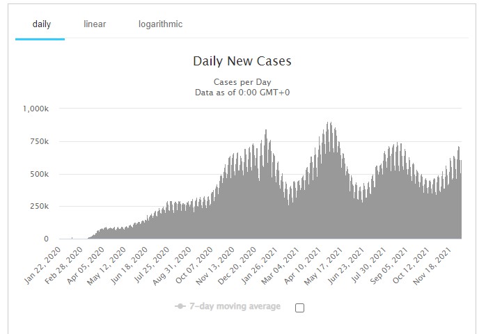
I’ll leave it as an exercise for the student to perform a Fourier-transform of the data to demonstrate these effects more convincingly.
Said colleague also pointed out this paper which has the title New indications of the 4-month oscillation in solar activity, atmospheric circulation and Earth’s rotation and the abstract:
The 4-month oscillation, detected earlier by the same authors in geophysical and solar data series, is now confirmed by the analysis of other observations. In the present results the 4-month oscillation is better emphasized than in previous results, and the analysis of the new series confirms that the solar activity contribution to the global atmospheric circulation and consequently to the Earth’s rotation is not negligeable. It is shown that in the effective atmospheric angular momentum and Earth’s rotation, its amplitude is slightly above the amplitude of the oscillation known as the Madden-Julian cycle.
I wonder if these could, by any chance, be related?
P.S. Before I get thrown into social media prison let me make it clear that I am not proposing this as a serious theory!


